Both London museums had the target audience of all ages, sexes, interests, nationalities and backgrounds.
The first place we visited was the amazing Science museum.

A Babbage Analytic Machine (circa 1871)
Customer expectations are met with facilities for all requirements. Advice, guidance, security, storage, washrooms, food counters and souvenir facilities are available on each of the four floors. Wheelchair access was accomplished with lifts everywhere.
Every exhibit is grouped by type, improving organisation and user comprehension. However, guides are not to be seen as often as desired.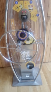
Premium experiences are available for customers who want more than the base service functionality of historical exhibitions.
One interesting interface here was a pay to use machine that created a souvenir. The creation process was made singular with the use of a wheel to turn, that powered its entirely mechanical procedure of creating a stamped coin. There was a single input for currency activation, a single output for the product and a simple singular control mechanism.
Although the system was linear and not digital, the mechanical interface allowed for user control and it’s transparent housing aided the system’s attractiveness and user satisfaction.
Another interface was found in touchscreen computer monitors that served a quiz and learning materials. The menu was simplified with its limited use cases and had audio feedback for accessibility. The service provided information about energy with games, stories, an encyclopaedia and cartoons – all under a three tiered menu of entry, type and choice.

The entry menu provides a limited pair of types (games, info) to ease usability and streamline the process. A monotone yellow and black colour scheme offers high readability.
There were many simple touchscreen interfaces beside exhibits, mostly with the single input of ‘forward’ to push users the next portion of information. In these cases, aesthetic pleasantry was a focus over functionality with a single use case. Where quizzes were present, the design was further simplified to aid usability.
One memorable interface was found in a simulation of the auxiliary telephone boards of old. It worked with the input of a headphone jack, that output audio to headphones. There were grids of ports that was meant to simulate a set of unique transmissions.
The illusion was spoiled fairly easily by checking to see if a specific speaker (channel/ transmission) would stay at its initial port. The system simulated the telephone switching mechanic by changing output every time the jack was inserted regardless of port. This design choice may be considered an error and a lesson to learn from.
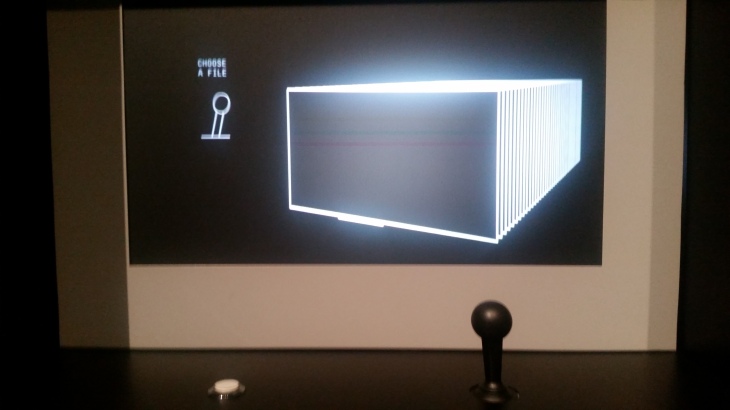
A directory of movie files was given a videogame’s physical and graphical interfaces.
The second place we visited was the Natural History Museum. A museum where, disappointingly for a ‘user’, most of the exhibits were fake.
With the same functions, target audience and purposes, this museum was different in the way that it had more of a flow path for users. This made information and exhibits harder to ignore but provoked some frustration in moving around. The pathways were narrowed, crowded and rigid which made exiting hard. I much preferred the Science Museum’s organised but open approach.
One interface here was a touchscreen providing a quiz for exhibitions. It aided learning and was simplistic. Offering no modes or accessibility functions, as with the ones in the science museum (bar audio feedback). The purpose of learning was a clear focus, with little room in its mechanics for breaking or confusion. Each view had only 2 control types: select and next. Colours were distinct and visibility was high with contrasting colours and simple design.
 A Google Maps 3D camera bike, used to develop ‘Streetview’ imagery, has the control interface of a numeric mini-keyboard and an extra-large seat.
From perusing these exhibitions, it is apparent that ‘the sciences’ are any art (artistry) of logic while natural history has its core as the artistic logic of nature. From an abstract perspective, these two areas of knowledge are roots of each other.
During the museum day, it was apparent that the methodology of user centric design involves ensuring that the expected or effective controls for mechanisms are conveniently available and secured. Also principled is the practice of making sure that use cases are able to be enacted in streamlined and efficient ways. One interesting finding is that, when unexpected by the desired users, a back function is not always present.

